Duthie Dental | Brand Identity
--
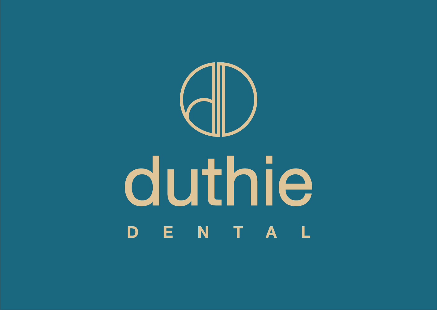
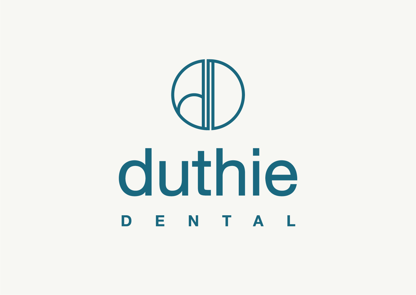
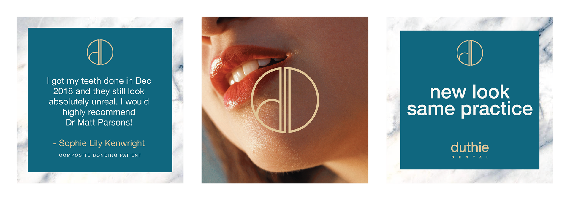
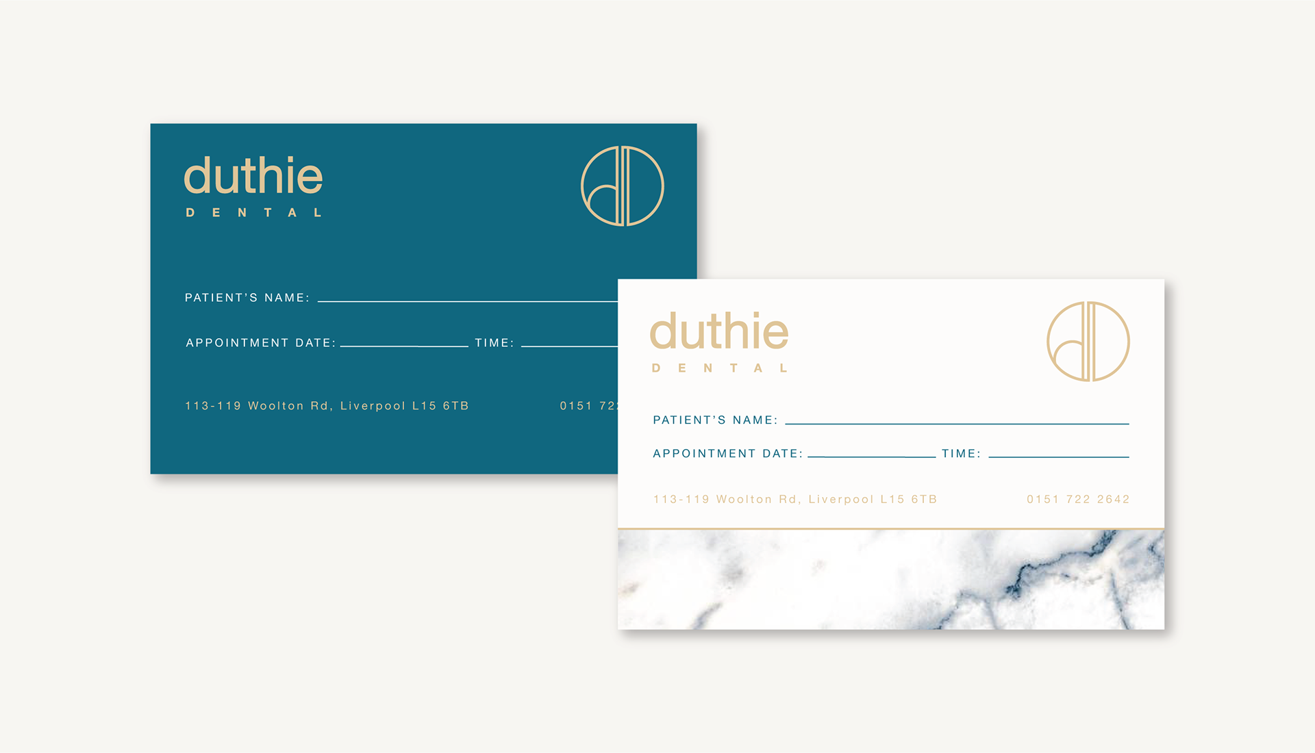
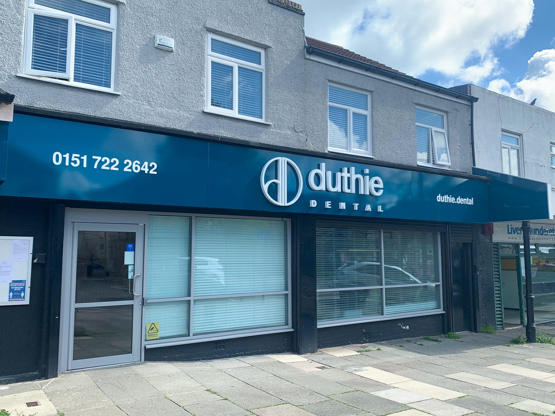
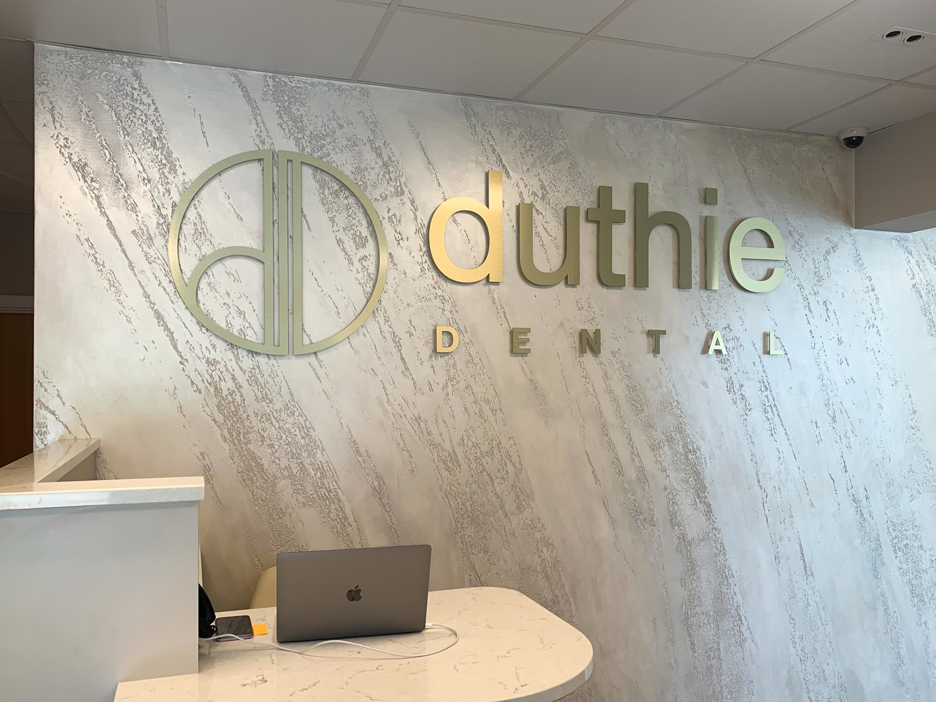
Duthie Dental are a premium, family-run private dental practice based in Liverpool. They came to us for a rebrand as their previous brand had started to feel tired and outdated. They wanted a new brand identity that would feel fresh, high-end, approachable and trustworthy. The rebrand also had to tie in with the renovations that were being done to the practice. The result is a sleek and simple visual identity that includes a “DD” icon and pairs nicely with the marble interiors and gold accents seen within the practice.
--
Duthie Dental are a premium, family-run private dental practice based in Liverpool. They came to us for a rebrand as their previous brand had started to feel tired and outdated. They wanted a new brand identity that would feel fresh, high-end, approachable and trustworthy. The rebrand also had to tie in with the renovations that were being done to the practice. The result is a sleek and simple visual identity that includes a “DD” icon and pairs nicely with the marble interiors and gold accents seen within the practice.


The Abbey by Duthie Dental
--
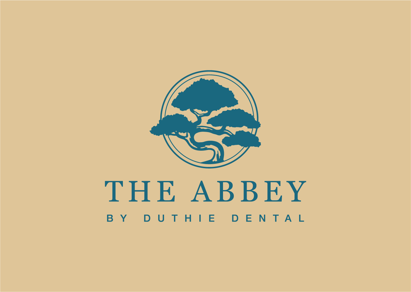
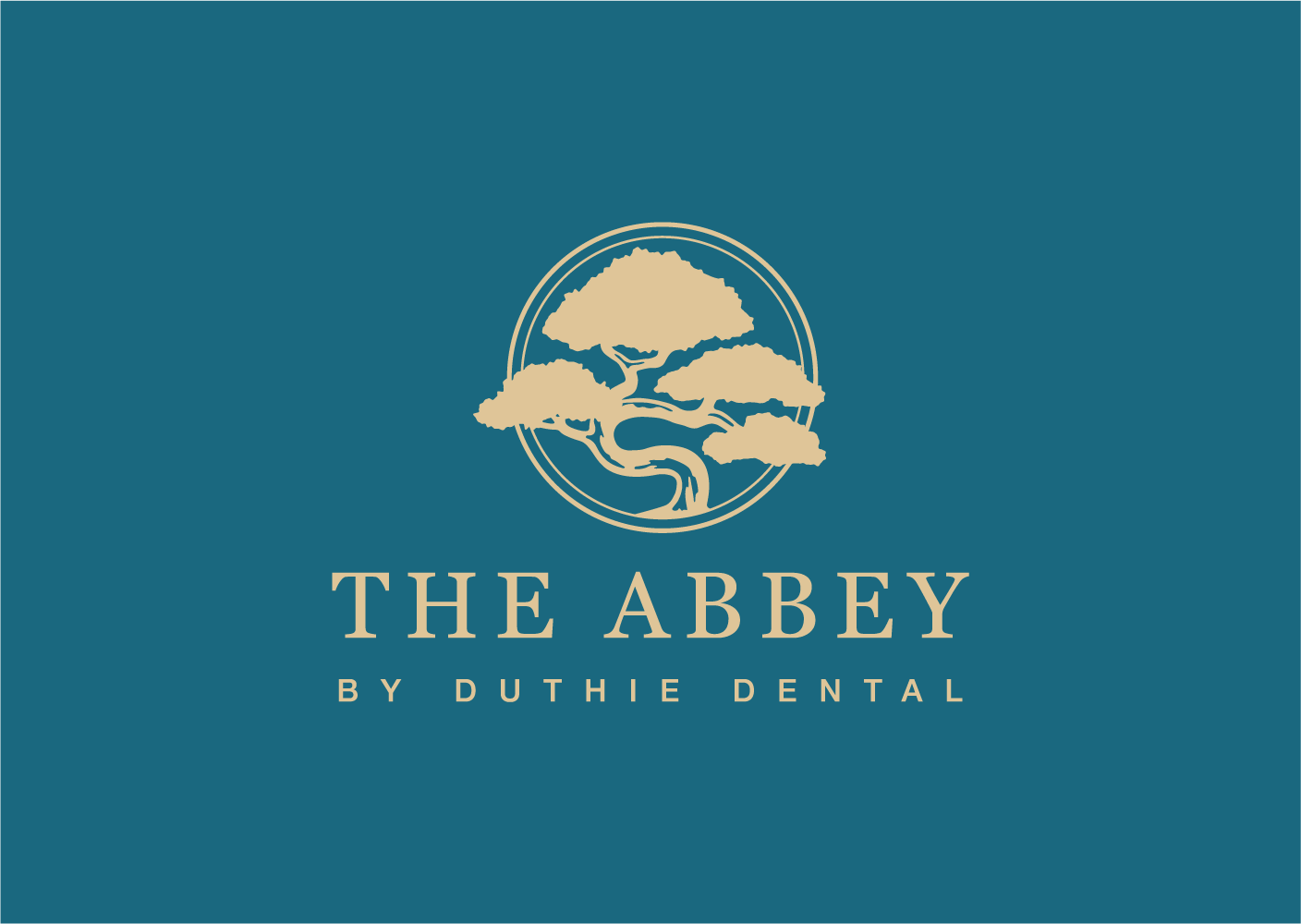
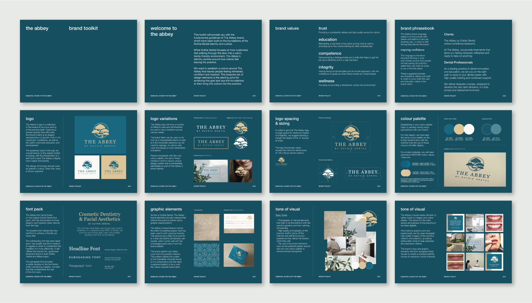
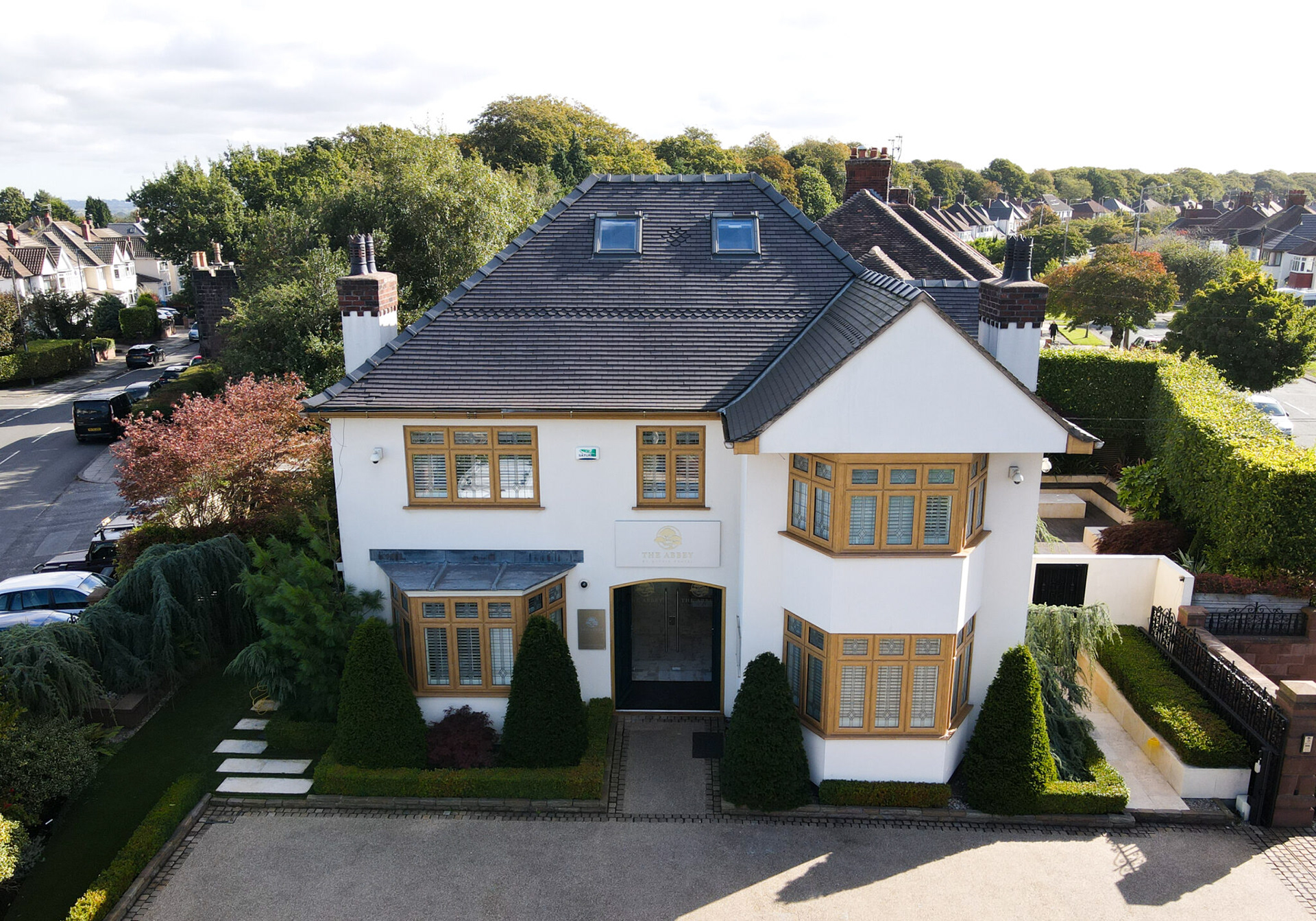
Once the initial rebrand was complete for Duthie Dental, the Duthie family moved onto their next venture, a sister practice specialising in cosmetic procedures. They wanted a brand identity that felt in-keeping with the original Duthie Dental brand, but could also stand alone as it’s own brand. The Abbey’s brand identity, therefore, borrows from the core identity but includes a new icon which is representative of the Japanese peace garden onsite. White marble was swapped out for a gold polished plaster and a serif font was introduced to elevate the identity even further.
--
Once the initial rebrand was complete for Duthie Dental, the Duthie family moved onto their next venture, a sister practice specialising in cosmetic procedures. They wanted a brand identity that felt in-keeping with the original Duthie Dental brand, but could also stand alone as it’s own brand. The Abbey’s brand identity, therefore, borrows from the core identity but includes a new icon which is representative of the Japanese peace garden onsite. White marble was swapped out for a gold polished plaster and a serif font was introduced to elevate the identity even further.